Making an effective call to action takes a little more than a simple "Buy Now!" How can you reach your visitors and spur them into buying?
The Details
According to some estimates, we see as many as 5,000 different advertising messages over the course of a day.
It's advertising overload, and there is no way the human brain has the time or energy to fully consider each message. Instead, we learn to ignore the majority of information that we're exposed to and only process the things that we think are important.
We scroll over webpages without reading all of the content on them. We commute home on the highway without taking the time to notice the every single billboard along the way. We tune out commercials on TV.
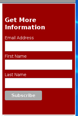
Here is an example of a website's lead collection form. It uses a pair of generic calls to action — one up top and one on the button text — for an informational signup form. Will these CTAs actually get noticed, or will most visitors scroll past this form?
The Strategy
Our hypothesis is that they won't get noticed. The call to action on a website has to express that message of importance, so visitors will stop and at least consider the proposition.
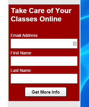
We changed the text to improve its chances. It uses a two-step call to action. "Take Care of Your Classes Online" stresses a benefit-oriented value proposition supported by the on-page context. This service allows visitors to take classes online, rather than dealing with the inconvenience of having to take them in person.
Step 2, "Get More Info" expresses what the visitor will get out of the transaction (informational materials), and presses them into action with active verbiage.
The Results
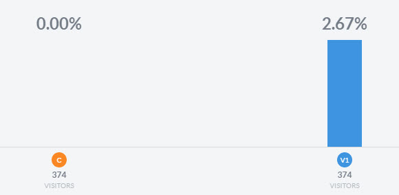
An "infinite improvement," because the control did not record a conversion during the course of our testing.
The Conclusion
People are exposed to more advertising than ever these days, which means that marketers and advertisers have to be especially effective if they hope to get noticed.
A simple, generic call to action like "Call Now!" or "Sign Up!" doesn't cut it with today's savvy web consumers. Marketers will be more successful if they stress benefits, emotional triggers, and tailor that call-to-action message to what is being offered. Even better, like the test above, you can split that call-to-action into multiple steps to build a truly persuasive website.
Get Started With Your Simple, 3-Step Conversion Optimization Strategy