Building a successful landing page is all about limiting distractions and keeping visitor attention in the right place. How do you do that?
The Details
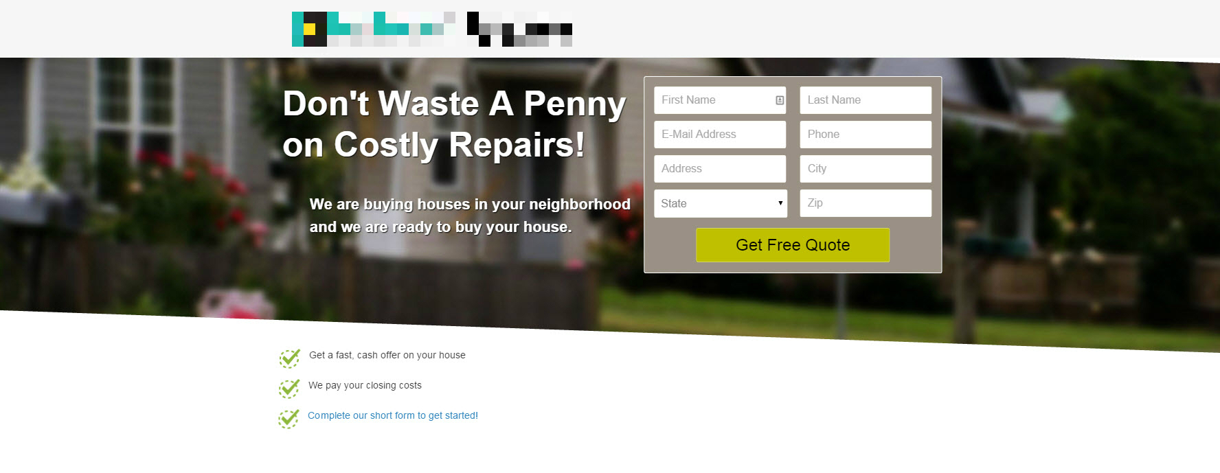
Below, we have an example of a landing page used to collect leads.

It got everything you need: A big, bold benefits statement, a “Who are you?” subheadline, additional copy to build trust (the pixelated lines), an image to push emotional triggers and then three more benefit-oriented bullets to drive it home.
But its weak spot is the layout. The “Get Free Quote” button is buried underneath everything. How do you drive more attention toward the signup?
The Strategy
We tweaked the geometry of the page to funnel more attention toward the form.
Using virtually all of the same content (we dropped the trust subheadline) we moved the important parts into this new sloped container.
Why would something like this work? It fits the natural scanning pattern that a left-to-right English reader would engage in. The box starts small on the left and expands as it goes rightward, so the viewer naturally follows that expansion to find the form.
The Results
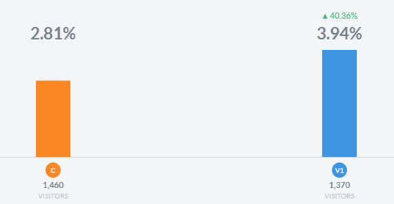
We saw a 40.36% improvement in conversions with the test page.
The Conclusion
Creating a landing page is all about managing attention. Unlike a home page — where a visitor might go to one of 50 different destination pages — a landing page is built with one single destination in mind, and an effective page will direct visitors to that destination.
There are a number of tricks available to do that, and manipulating the page geometry is one of them. Using shapes, shading, and imagery can direct the visitor’s attention to areas of emphasis and, ideally, make it easier for them to convert.
Get Started With Your Simple, 3-Step Conversion Optimization Strategy