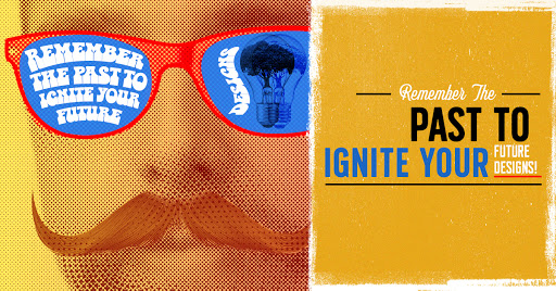
Remember The Past To Ignite Your Future Designs

Throughout history, there have been countless brilliant advertisements and poster designs, whether they be political posters, selling and promoting product advertisements, movie posters, or event posters. Inspired by different art movements and artists through the decades that incorporated and started various techniques, fonts, and photographic and illustrative styles. Counting down the most influential design aspects through time based on how influential and how aesthetically pleasing they were.
Going back to the early 1900s was the beginning of one of the earliest 20th-century art movements that were known as Art Deco. Art Deco, or Deco, is the style of visual arts where design and architecture were profoundly embraced. Advisements and posters were created by designers such as Schulz Neudamm, who in 1926 designed for the film Metropolis. Today, you’ll see a lot of people using a similar combination of art deco and futurism to achieve this beautiful look. It also grabs attention by breaking free from poster dimension standards and creating a huge block of white space between the title and the foreground figure. This goes back to the famous phrase “King of the Page.” It showcases hierarchy and defines what is the most important element within the design. It not only showcases design layout but printmaking techniques, which today artist can incorporate now by implementing various techniques like gradients, halftones, air, and paintbrush layers, and shadows.
USA Baut a movement that consists of typographic and one of the starts of modern layouts emerged in the mid-1940s, where today 21st-century artists incorporate almost everywhere in print and digital advertisements. An example of this is when designer Max Bill designed an exhibition poster in 1945. As part of the International Typographic Style movement, Max Bill adhered to strict design principles which are evident in this prime example. The photographs are aligned on an invisible grid and then tilted to create more interest and dynamic within a pretty simple design. And in true Typographic Style fashion, a generic sans-serif is used for the title and date of the exhibition.
Going further in time to the 1960s, to the decade of psychedelic posters and advertisements. One of the most famous posters was designed in 1967 by Victor Moscoso. It was a poster for the Chambers Brothers and the idea behind these types of posters was that if you couldn’t read them, then you weren’t the type of person the poster was intended to reach. The way that Moscoso makes the typography interact with the photograph is perfect. Also noted is the incorporation of the halftone photographic technique, which today artist can easily incorporate in today’s advertisements. Big brands such as Fanta, 7up, Campbells Soup, and Musical legends such as the Beatles and Jimi Hendrix have all incorporated this movement bright hues and free-flowing promotional designs.
The most influential artist has come from these massive art movements, one most notable to mention is Paul Rand. He not only inspired an era but his techniques are vastly used for today’s designers. His famous poster in 1981 for computer technology giants IBM. It’s a pretty simple design with basic illustrations however he based the design on the Rebus principle which in short is the practice of using the sound of one or more words to mean something totally different. Very clever, but what would you expect from Paul Rand? Remembering art movements and artists such as Paul Rand help paved the way for today’s designers by incorporating similar techniques, layouts, fonts, and clever approaches to digital and print design.
